The good news: In wake of Target's announcement that they would stop stocking collectable cards in-store, I was able to find cards at my local Wally World. The bad news: It was Panini. Still, I bought a pack, if for nothing else to have this post to write. So let's take a look at what will likely be the only pack of Panini Diamond Kings I open this year.
#66 Leody Taveras (RC)

The honor of the first card goes to...this guy. I've generally liked the overall design of the Diamond Kings set the past few years, but this one defies logic. Panini must know that not having an MLB license is a negative, right? So why highlight that fact by devoting a quarter of your card space design to a banner to depict the City/State of these unnameable teams? The picture is squeezed by too much border, and there is just a lot of wasted space here.
#24 Harmon Killebrew
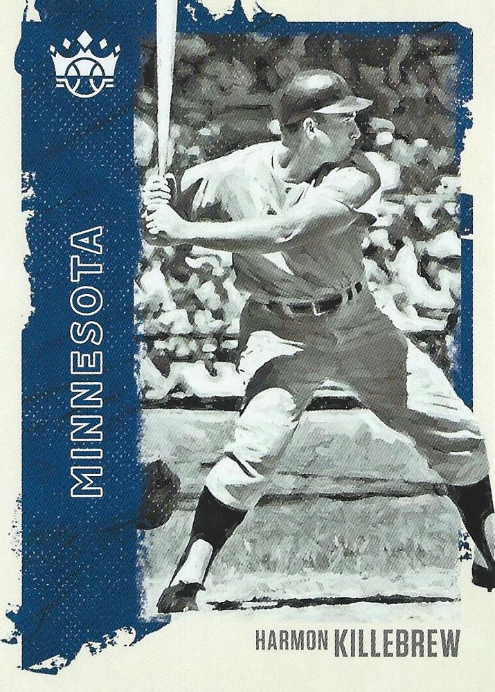
I will say however that the color borders contrast really well with black-and-white photos. Again, rearing back those borders and letting the picture be the main focus would have made this card so much better.
#81 Alex Bregman
#38 Garrett Crochet (RC)
#95 Walker Buehler
#53 Ryan Jeffers (RC)
#11 Mickey Mantle

Here's a look at the back. I like the marbled effect on the back, but it doesn't show up very well on some of the darker colors. Typical Panini back with more empty space that could have been utilized to make the backs more readable.
#34 William Contreras (RC)
#91 Christian Yelich
#49 Jesus Sanchez (RC)
#7 Pete Rose

Pete Rose must be ecstatic that he gets to still appear on baseball cards...
#142 Travis Blankenhorn (RC) (Red Frame parallel)
#49 Jesus Sanchez (RC) (Artist's Proof parallel)
#LL-17 Walter Johnson (Legacy Lithographs insert)

Panini's inserts and parallels are usually pretty blah, but every now and then a nice one comes out. I really like the look of these Legacy Lithographs. I've said this over and over, but Panini should focus on these older players that don't suffer from a lack of a logo or team name on the uniform.
#A-7 Gerrit Cole (Aficionado insert)
#149 Jake Cronenworth (RC, SP)
#DDK-MT Alex Kirilloff (Debut Diamond King insert)

The old Perez-Steele Diamond Kings were one of my favorite things about Donruss sets. What it's become saddens me. This card lacks personality.
#109 Joe Wood (SP)

My first and only Red Sox card in the set. For the third straight year, the exact same photo is used for Wood, only this time in black and white. Why Panini does this baffles me. I know they have access to other photos of him (He has a head shot in his Legacy Lithographs insert, along with this pose again). Oh, and this rehashed photo is a short print to boot! What a desirable card for people to chase!
#104 Yogi Berra (SP)
#DDK-KR Brady Singer (Debut Diamond King insert)
Diamond Kings hasn't done much to innovate and make the brand more appealing to collectors. It almost seems like Panini is content with just doing the bare minimum. It's a shame, because there is a desire for options outside of Topps.
For what it's worth, I'll probably keep the Killebrew, Johnson, Wood, and Berra. If anyone is interested in trading for the others, I'm all ears...
Sucks about Target.
ReplyDeleteRose wins the round.
I'm in on the Kirilloff DK
ReplyDeletei'd be interested in the buehler and the rose. it looks like rose might be in dodger stadium. and kiriloff looks like he plays for the royals. at least you got to open a pack!
ReplyDeleteAgreed. Diamond Kings would look a lot better if they stuck to the legends. Also agreed on the photo reuse, it just kills this set.
ReplyDeleteI'm about the only one who likes the design this year. I like the "window" look.
Always plenty of yawn from this set, though I agree that the lithographs insert is well executed.
ReplyDeleteI'm not sure about this year's design. I'm sure I'd pick some up if I see them in the wild but probably won't chase them otherwise. I think the Rose is my favorite of the group you showed. Good post.
ReplyDeleteYeah, this design is no good.
ReplyDelete