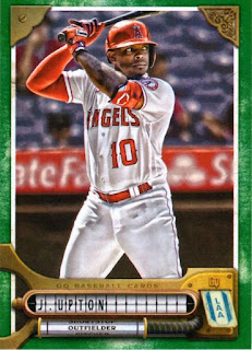
This year's Gypsy Queen set has been out for awhile now. I've seen a few cards posted here and there, and to be honest, I love the design! It's possibly my favorite design since 2015 Topps came out. I was very happy to find a box in the wild, and would like to share my impression as I opened up 7 glorious packs:
Pack 1
#67 Lucas Giolito
The honor of the first card goes to Lucas Giolito. So let's get right to this design and what I enjoy about it. It has a steam-punk like quality to it. You get hints of intricate metal-work holding the picture in place. The name and position, while still small and hard to read, at least presented in a fun way. The team ticket reminds me of those little prize tickets you earn playing Skee-Ball. The overall design is fun, and I feel very creative.
#193 Austin Hays
#60 Lars Nootbaar (RC)
#18 Vladimir Guerrero Jr.
#59 Gio Urshela (green parallel)
#100 Michael Conforto
#51 Devin Williams
Pack 2
#205 Brandon Crawford
#101 Max Muncy
#191 Willy Adames
#GGM-9 Pete Alonso (Gypsy Gems Minis insert)
I'm not a fan of minis, nor am I fan of astrology, but this insert is shiny and downright pretty. The picture does not do it justice.
#44 Spencer Strider (green parallel)
#15 J.D. Martinez
The second pack hits me with the first of I hope many Red Sox cards. It's a basic shot of Martinez running (or dancing, you never know, he could be dancing), and his red jersey looks really good with the overall design.
#44 Spencer Strider
Pack #3
#122 Corey Seager
#294 Matt Carpenter
#199 Jorge Soler
#41 Dansby Swanson
#40 Didi Gregorius (green parallel)
#177 Corbin Burnes
#211 Pete Alonso
Pack #4
#173 Ryan Vilade (RC)
#160 Anthony Rizzo
#258 Colton Welker (RC)
Another noteworthy aspect of the set if the muted colors on the Rookie Card symbol. It never looked right when a set designed to look vintage had such a glaring modern graphic element to it, and the change here actually makes it feel like it's part of the set. I'll admit, there were a few times a missed that logo completely when thumbing through the cards!
#156 Andrew Benintendi
#259 Gavin Sheets (green parallel)
#128 Spencer Howard
#292 Luis Frias (RC)
Pack #5
#227 Gary Sanchez
#38 Trent Grisham
#219 Dallas Keuchel
#142 Brandon Nimmo
#177 Corbin Burnes (green parallel)
#234 Alex Krilloff
#32 Josh Bell
I haven't discussed the back yet. It's a pretty typical GQ back, and the small font issues that have plagued Topps sets continues here. I wish the backs had a more coordinated look with the front, with maybe some metal brackets or bolts. This back is too generic and could appear on any GQ set.
Pack #6
#192 Rhys Hoskins
#96 Mike Clevinger
#152 Edward Cabrera (RC)
#141 Sonny Gray
#248 Joey Gallo (green parallel)
#43 Brian Anderson
#286 Tim Anderson
Pack #7
#167 Starling Marte
#17 Vidal Brujan (RC)
#119 Franmil Reyes
#164 Josiah Gray (RC)
#77 Justin Upton (gren parallel)
The green parallels are plentiful, and fortunately they look really good with this set. Perhaps a different shade of green would have looked better for the vintage look, but this color pops and I don't mind it one bit.
#36 Ozzie Albies
#127 Anderson Tejeda
Design-wise, I adore this set. The only thing keeping me from considering a set build are those blasted short-prints. Otherwise, this is easily my favorite set of the year!


GQ is plagued with issues to my way of thinking. I do like the design only because it's a vast change from the GQ tradition. I still don't like the look of the photos though.
ReplyDeleteI've never seen this design. I do like the steampunk aspect but it looks like the names would be very hard to read in person.
ReplyDeleteWith the good players, green parallels, and rookies, it looks like you did okay.
ReplyDeleteTo me Gypsy Queen (and Allen Ginter) represents to me what 1979 Topps was in 1979. The cards that represent the baseball season for me. The painted matted photos just look classy to me. Brings back that 1952-1956 card feel.
ReplyDeleteHaven't bought any of this stuff and probably won't unless I stumble across a blaster and I have an itch to scratch. That being said... it's the best GQ design in years.
ReplyDeleteI'm good with the design except for how they did the name. Frustratingly hard to read. Good post!
ReplyDeleteThey're not for me, but I don't dislike design though, it's actually kind of nice in a way.
ReplyDelete